Creating a Diagram Creator custom question
The Diagram Creator custom question type lets you create and edit a diagram on a canvas. Candidates can use a variety of tools to create diagrams, such as pencil, line, text, shapes, and flowcharts.
This article explains how to create a Diagram Creator question in Surpass.
In this article
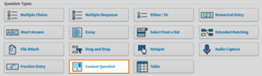
1. Choose your item type
In your subject, select Create New Item to open the Question Types menu. Choose Custom Question to create a blank Custom Question item and go to the Edit screen.
2. Name your item
Enter the item’s name in the Name field.

3. Enter your question text
Enter your question text in the question stem. Select Add text Area to add an additional question stem. You can have a maximum of five question stems per item.
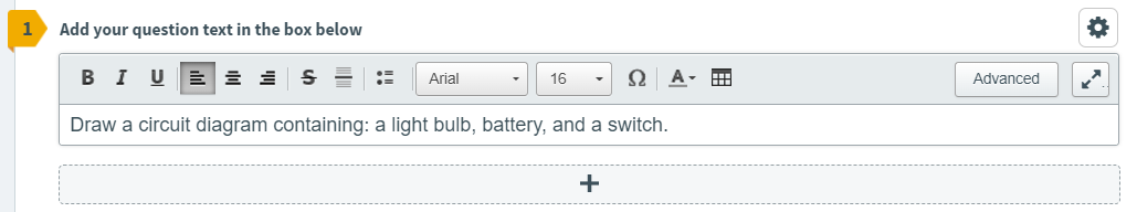
Open Additional Options to add source material or assistive media to your question stem.
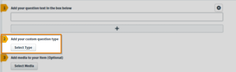
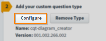
4. Add your custom question type
Select Select Type to open the Select Type dialog.
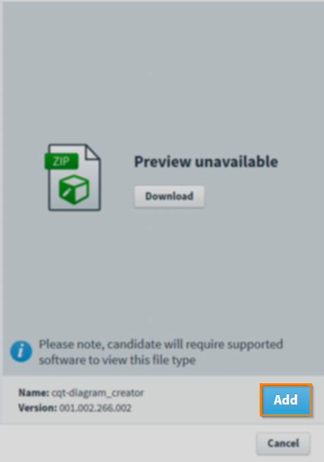
Select the ZIP file you want to add to your item.
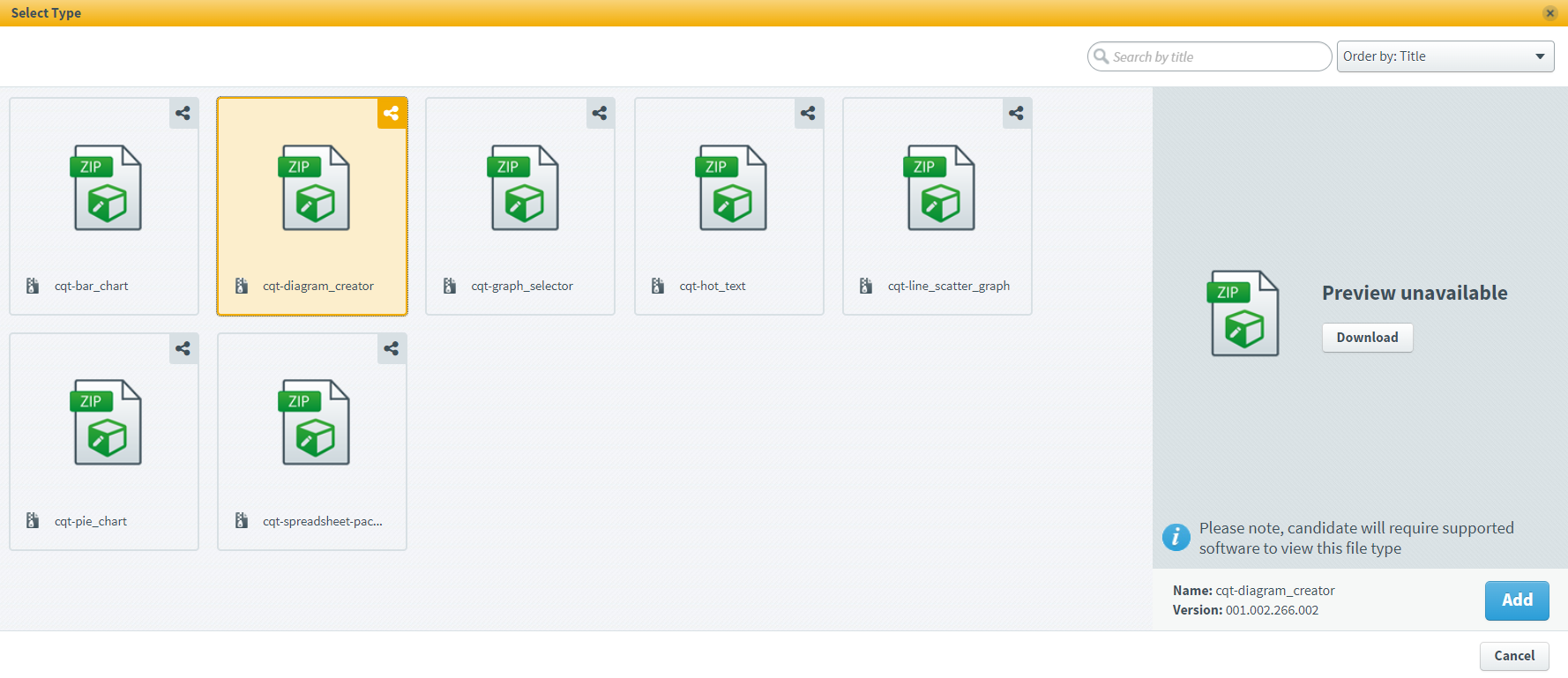
Select Add to add your Custom Question type to the item.
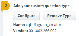
Once added, the name and version number of the Custom Question type are detailed in the item.
Uploading custom question ZIP files to the Media Library
Custom Question type ZIP files must be uploaded to the Media Library.
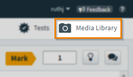
Go to Item Authoring and select your subject.
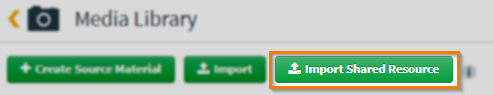
Select Media Library .
Select Import Shared Resource .
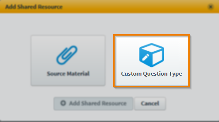
In your device’s file explorer, choose the file and select Open.
In the Add Shared Resource dialog, select Custom Question Type.
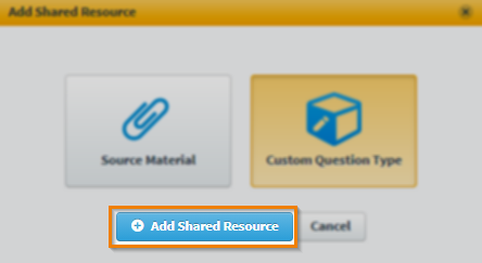
Select Add Shared Resource .
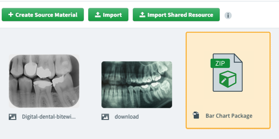
The ZIP file is now in your subject’s Media Library.
5. Configure your Diagram Creator custom question
Select Configure to open the custom ZIP file. This allows you to change how the item displays in delivery.
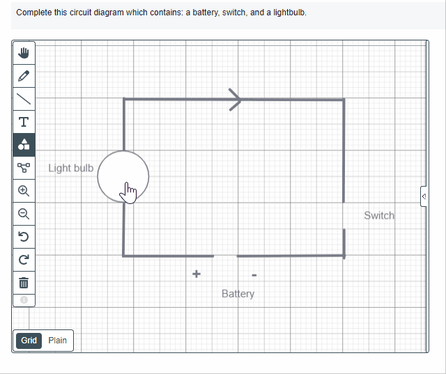
The Diagram Creator dialog contains the following tools:
- Hand
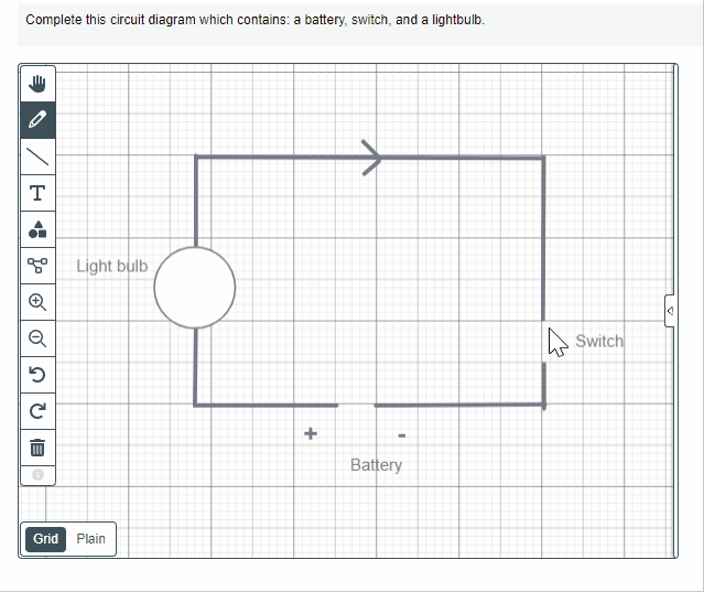
- Pencil
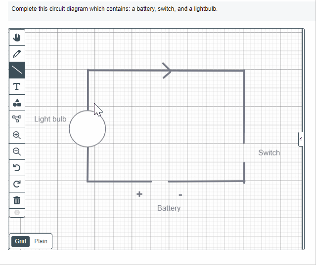
- Line
- Text
- Shapes
- Flowchart
- Zoom In
- Zoom Out
- Undo
- Redo
- Delete
Setting up the Diagram Creator
The toolbar can be used to select tools to use on the grid/canvas.
The Properties bar can be used to edit parts of the diagram further, including the line thickness, colour, and layering.
Settings & Tools allows you to select how the item is presented to the candidate.
| Tool | Description |
|---|---|
| Hand |
Selects a part of the diagram. |
| Pencil |
Draws a line that is not straight or restricted in direction and size. |
| Line | Draws a straight line. |
| Text | Inserts text. |
| Shapes | Drag and drop shapes on to the grid. |
| Flowchart |
Drag and drop shapes on to the grid that can be connected with lines. |
| Zoom In | Increases the scale of the diagram. |
| Zoom Out | Decreases the scale of the diagram. |
| Undo | Removes the most recent addition into the diagram. |
| Redo | Adds the most recent deletion back into the diagram. |
| Delete |
Deletes a part of the diagram. |
Tools
Tools can be used to insert, delete, and change components of the diagram.
Hand
Select and drag the canvas to navigate around the diagram.
Select and drag to move individual parts of a diagram.
Pencil
Select and drag to draw freehand on to the canvas.
Line
Select and drag to draw a straight line.
Curved Line
Select and drag to draw a curved line. Use the circles to adjust the curve.
Text
Select to insert a text box. Highlight the question marks to begin inserting your text.
Shapes
Select and drag the shape on to the canvas.
Flowchart
Select and drag the symbol on to the canvas and then select and drag between symbols to connect them with a line.
Highlight the question marks to change the labels of the symbols.
Maximise/Minimise
Select Maximise to zoom in on the canvas.
Select Minimise to zoom out of the canvas.
Undo/Redo
Select Undo to remove the most recent addition to the diagram.
Select Redo to reinstate the most recent undo action.
Delete
Select a component of the diagram and select Delete to remove it from the diagram.
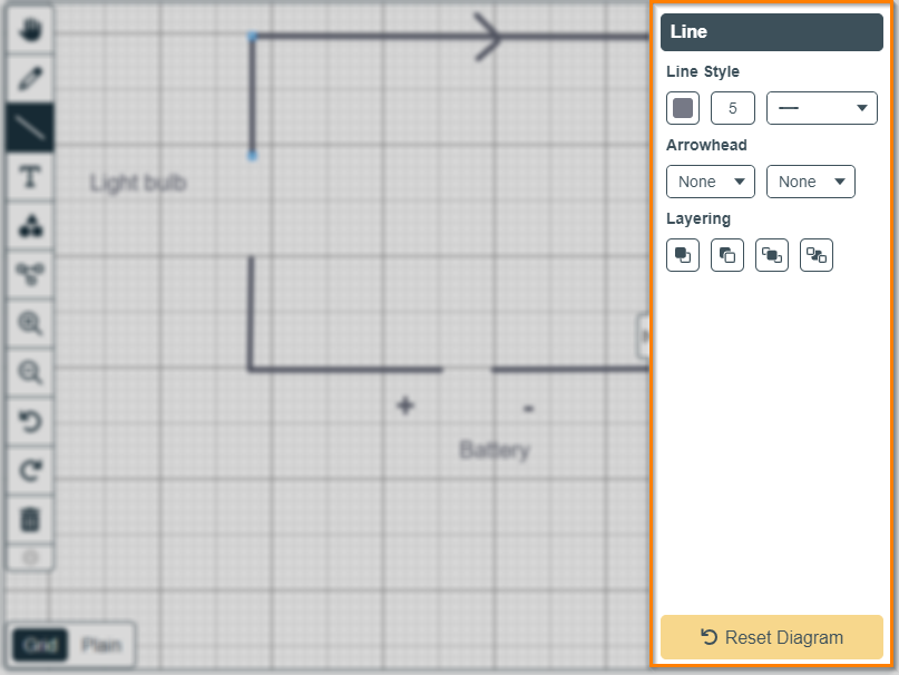
Properties
You can further edit lines, text, shapes, and flowcharts using the Properties panel. This panel consists of several properties that can be changed depending on which tool is selected.
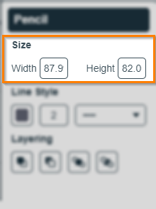
Size
Change the Width and Height values to change the size of the tool. Size properties are available to edit for Freehand, Shapes, and Flowchart.
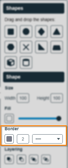
Border/Line Style
Change the thickness of the border by editing the value of the Border. Use the drop-down menu to change the border line pattern and select the colour palette to change the border colour. Border properties are available to edit for Freehand, Line, Shapes, and Flowchart.
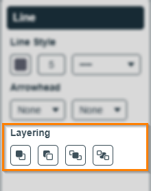
Layering
Change the layering of tools in the diagram by selecting either Move Up, Move Down, Bring To Front, or Send To Back. Layering properties are available to edit for Freehand, Line, Text, Shapes, and Flowchart.
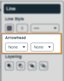
Arrowhead
Add arrowheads to either end of a line using the Arrowhead properties. Arrowhead properties are only available for Line.
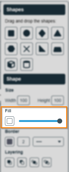
Fill/Colour
Change the fill/colour of the tools using the Fill/Colour buttons. Use the slider tool to change the transparency of the fill/colour. Fill/Colour properties are available for the Text, Shapes, and Flowchart tools.
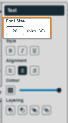
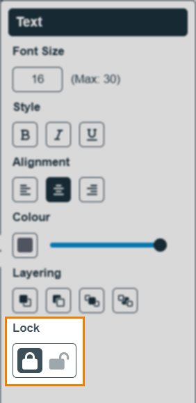
Font size
Change the value in the entry field to increase or decrease the font size. Font Size properties are only available for the Text tool.
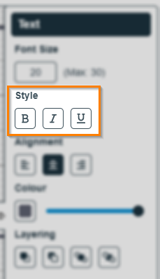
Style
Use the bold, italic, and underline settings to change the style of the font. Style properties are only available in the Font tool.
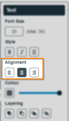
Alignment
Change the alignment of fonts using the Align Left, Align Centre, and Align Right buttons. Alignment properties are only available in the Font tool.
Lock
Determine whether the component is locked or unlocked (and available to edit by candidates). The ability to lock/unlock is available for all tools.
Settings & Tools
Choose which settings and tools are available to candidates in delivery.
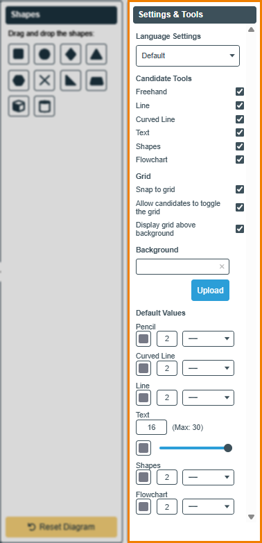
| Settings/tools | Description |
|---|---|
| Language Settings |
Configure the language used for this item. The available languages are English (also the default language) and Welsh. The selected language is applied to the Diagram Creator for both the item author and the candidate in test delivery.
IMPORTANT: Candidates are not able to change the selected language in test delivery.
|
| Freehand |
Allow candidates to use Freehand. |
| Line |
Allow candidates to use Line. |
| Curved Line |
Allow candidates to use Curved Line. |
| Text | Allow candidates to use Text. |
| Shapes | Allow candidates to use Shapes. |
| Flowchart | Allow candidates to use Flowchart. |
| Snap to grid | Allow candidates to snap points to the grid. |
| Allow candidates to toggle the grid | Allow candidates to toggle between the grid or plain background. |
| Display grid above background | Layers the grid over any background image uploaded into the diagram. |
| Background | Select Upload to insert an image as the background canvas of the diagram. |
| Default Values | Configure the default colour, size, and line type for each component. |
6. Save your configuration
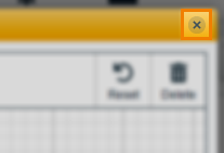
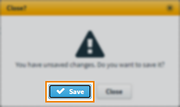
To save your configurations, select Close .
Select Save .
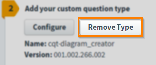
Removing custom question types
Once uploaded, Custom Question types can be removed from your item.
Select Remove Type to remove a Custom Question type.
7. Set the question’s marks
Set the item’s total marks in the Mark field.
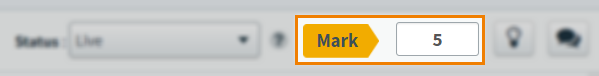
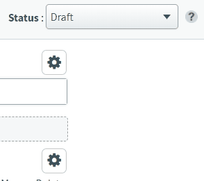
8. Select a workflow status
Set the item’s workflow status in the Status drop-down menu. Only items set to Live can be used in a test.
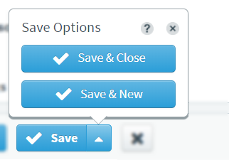
9. Saving and closing your item
Select Save to save your item to your subject.
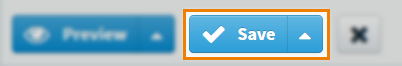
To see additional saving options, use the Save arrow to open the Save Options menu. Select Save & Close to save the item and return to the Subjects screen. Select Save & New to save the item and create another Custom Question item.
Select Close to leave the Edit screen. If you have unsaved changes, you are prompted to either save or discard them.
Further reading
For information on the other available Custom Question Types, read the following articles: